React Hooks in Svelte
I came across a repo by Josh Nussbaum comparing React hooks with Svelte through examples, and I thought it would be fun to present it as a static website.
I wanted a reason to use SvelteKit 1.x with Skeleton UI, and this was the perfect opportunity.
So why make something about React? If you haven't picked it up from my ramblings, I've been successfully avoiding React since forever because Svelte is amazing. But life is unpredictable, and this year I got a new job where React is part of their stack. So it makes sense for me to learn React, and what better way to do it than to contrast with how the equivalent thing is done in Svelte?
The live demo is hosted on Vercel. The source code is on GitHub.
Without further ado, here are some new things I used on this project.
SvelteKit 1.x
While I've used SvelteKit briefly pre-1.0, this is the first project where I'm using the final 1.x release.
Recently I saw this tweet from Daniel Imfeld about importing raw code from another file or component in SvelteKit and I thought I could use this technique for the React vs Svelte code examples. I'll talk about it farther down.
Skeleton UI
I heard about Skeleton UI briefly on Twitter, but my interest was really piqued when I listened to the Podrocket episode Using Svelte and Tailwind to build reactive interfaces with Chris Simmons. After browsing the docs I was sold.
Skeleton is a UI library built with Svelte and Tailwind CSS. Sort of like Tailwind UI for Svelte, if you will. It's currently in beta, but is about to be released as a stable 1.0 version soon.
Skeleton is a very ambitious project that aims to provide (almost) complete coverage for all manner of styled Svelte components you might need.
In the short time I spent using it, I found it to be very well-thought-out and easy to use. It's great for building UI prototypes fast.
I did run into a couple issues, but at least one of these was resolved, however not yet tagged. It's cool though, as v1.0 is just around the corner.
These are the Skeleton components I used to put together this mini-project:
- App Shell - for the site outline
- App Rail - for the left sidebar menu
- Cards - to show all the hooks on the homepage
- Code Blocks - to display the code examples
- Lightswitch - to toggle between light and dark mode (currently disabled due to an issue with the beta version of this component)
- Gradient Headings - to style the homepage H1
On building the code examples
I really dig SvelteKit's routing. Essentially the routes directory is a collection of Svelte components that are automatically routed to based on the file structure.
Inside each directory there's a +page.svelte file which holds the actual page content, typically paired with a +layout.svelte file that holds the page layout.
Children directories inherit the parent +layout.svelte file. But you can also override it by placing a +layout.svelte file in the child directory.
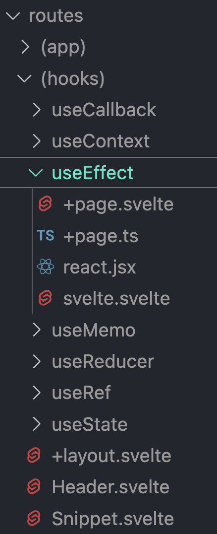
What do you do if you want to use the same layout across a bunch of child directories? In my case, I wanted to use the same layout for all the hooks (the side-by-side React vs Svelte code blocks). SvelteKit makes this easy by allowing you to place all the child directories in a directory surrounded by (), in this example (hooks).
The result is that in the browser the URL will look like this: /useEffect. If the parent had been named hooks, the URL would have been /hooks/useEffect, but that's not what I wanted. In other words, it's a way to "namespace" the child directories and to apply the same template to all of them while keeping the URL clean.
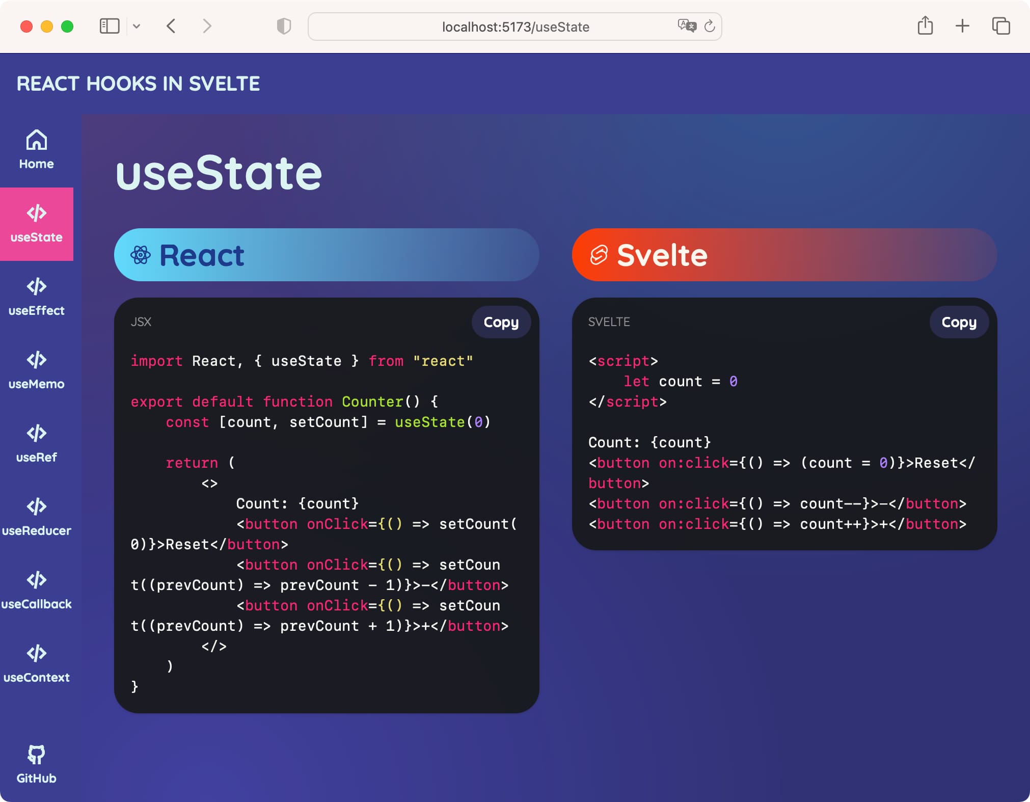
I placed each hook example in its own folder (useEffect, etc) with the following contents:
+page.svelte- empty file, just because SvelteKit requires it+page.ts- the "API" that provides the raw code for the React and Svelte examples and passes it to the layout as propsreact.jsx- the raw React code examplesvelte.svelte- the raw Svelte code example
Back to +page.ts, these are the contents:
import type { PageLoad } from "./$types"

export const load = (async ({ params }) => {
    return {
        title: "useEffect",
        react: (await import("./react.jsx?raw")).default,
        svelte: (await import("./svelte.svelte?raw")).default,
    }
}) satisfies PageLoad
This uses Daniel Imfeld's raw import technique mentioned above. The cool thing about it is I can keep each example in its own native file extension, so .jsx for React and .svelte for Svelte. This makes it easier to read and edit the code examples, but also works well in the IDE.
The (hooks)/+layout.svelte template can use these properties to display the code examples:
<script>
    import { page } from "$app/stores"
    import { CodeBlock } from "@skeletonlabs/skeleton"
    import Header from "./Header.svelte"
</script>

<!-- Page Route Content -->
<slot></slot>

<Header>
    <svelte:fragment slot="header">
        {$page.data.title}
    </svelte:fragment>
</Header>
...
<CodeBlock code={$page.data.react} language="jsx" />
...
<CodeBlock code={$page.data.svelte} language="svelte" />
...
To tell the truth, I'm not convinced this is the best approach. I had some trouble getting slots to behave the way I wanted inside each hook's +page.svelte, so I resorted to using +page.ts instead, with the associated duplication. I'm sure there's a better way to do this, but I'm still learning SvelteKit.
Overall, I'm pretty satisfied with how this works. It's trivial to copy-paste each hook directory and change the title prop and the code examples.
Conclusion
It took me about 2 days of casual tinkering to put this together, and I'm pretty happy with the result. Once Skeleton UI is released as a stable 1.0 version, I'll go back and fix a few things. I was glad to kick Skeleton's tires, and I'm sure it will become a staple in my toolbox.
SvelteKit is fabulous, though I'm a not very proficient in it. I can only hope that I will have more opportunities to use it in the future.