2024 site refresh
Freshly motivated at the turn of 2024, I started working slowly but steadily on refreshing the ChasingCode site and blog. It took a month of daily tinkering before releasing v2 on February 1st.
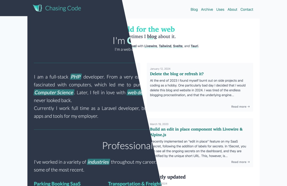
Here are some of the design decisions and highlights.
I almost called it quits
I came close to deleting the site at the end of 2023. Looking back, I'm glad I didn't. The refresh has given me a new desire to blog (at least for the time being).
The two main themes of the refresh
I went into this with two overarching themes in mind.
First, I wanted v2 to be more content-focused starting with the landing page. Previously, the site index had a lot of yada-yada about me. I moved all of that to separate sections under about. It includes work experience, hobbies, and side projects.
While initially I saw it as a personal/portfolio site with a blog attached, over time I realized that the landing page had remained frozen in time. Truth be told, I don't think anyone benefited from reading a long list of my personal stuff whenever they loaded the site, especially since that content was mostly static.
Now, the landing page is "alive" with featured, recent, and recently updated posts. There's also a tag cloud because I like tag clouds and it reminds me a little of the old web.
Second, I wanted to simplify the design and give it a slight utilitarian/brutalist vibe. I was also toying with the idea of going the opposite way by making it very colorful, but in the end I settled on what you see currently. For a first pass I think it looks great, though it's only 2/10 brutal if you ask me.
Blog engine update
I touched on this here, so I won't rehash it. Basically I upgraded Jigsaw to the ~~highest version possible, though not the latest because I'm constrained by Netlify's outdated infrastructure~~ latest version (1.7.1).
Typography
I came across Modern Font Stacks and immediately embraced the concept. Using native fonts is a great way to improve site performance. I gave up on the initial idea of using fancy fonts and self-hosting them.
Here's how I changed my fonts. I think they look a lot better and load instantly on any platform, without jank.
- Body font:
Lato-> System UI stackfont-family: system-ui, sans-serif; - Heading font:
Bitter-> Transitional stackfont-family: Charter, 'Bitstream Charter', 'Sitka Text', Cambria, serif; - Monospace font:
Consolas-> Monospace stack (very similar)font-family: ui-monospace, 'Cascadia Code', 'Source Code Pro', Menlo, Consolas, 'DejaVu Sans Mono', monospace;
I also changed the blogpost font size from 20px to 16px. I've become partial to small text lately.
Article column width
I narrowed the main content column from ~110 characters to ~80 characters. This makes it easier to scan a line of text and is just over the recommended 75 max line length.
Bundle size
My JS bundle stayed the same. At 231 KB I think it is too high, but this is coming mainly from Jigsaw and a couple of Vue components. I should really refactor these to Alpine or similar but I don't have the willpower right now.
The CSS bundle dropped slightly from 34.7 KB to 31.3 KB. Not a lot, but better than nothing. I can do more optimizations here for sure. For one thing, I think I have one too many breakpoints (both sm: and md:). For another, I would like to do a color pass at some point and restrict the color palette (currently teal) to 2-3 theme shades instead of 3-4.
Lighthouse
Lighthouse scores are 100 for performance and almost 100 for the other categories. There are certainly a few improvements I could make here as well.
Categories are now tags
To me, putting an item in a category has always felt the equivalent of putting it in a folder, in other words it can't be in more than one category at the same time. In a default Jigsaw installation, categories act like tags.
I like tags because an item can have more than one tag, so it made sense to rename categories to tags.
I also changed tag names from camel case to lowercase or kebab case for multi-word tags. Examples:
/blog/categories/Laravel->/blog/tags/laravel/blog/categories/MySQL->/blog/tags/mysql/blog/categories/DevTools->/blog/tags/dev-tools
I think I might also rename the general tag to random.
Layout tweaks
There are, of course, many layout improvements on every page, particularly on the landing page, the blog index, blog post, post archive and about section.
Color palette
One of my redesign goals was to change the color palette from the standard Tailwind teal to something else. This kept me going back and forth for days, without a clear result. Teal is rather cold and sterile, and I wanted something more vibrant - a red, purple, or yellow/orange. Because this was holding me back, I decided to leave it as is for now, and continue exploring options after I launch v2.
Takeaways and the future
I am very happy with how the refresh turned out. It only took one month of late-night work sessions, and I launched it unceremoniously on February 1st. Truthfully, I wasn't expecting to complete it so soon.
The main benefit is that a clean, fresh look motivates me to post more frequently. It remains to be seen how long this newfound enthusiasm will hold, but I've already collected a bunch of ideas on various developer-adjacent topics that I would like to post.
There are many things that I'd like to add and improve, however.
Apart from posting, I'd like to add a blogroll section for some of my favorite tech blogs. Then I think it would be cool to have games and books sections where I briefly mention my favorite games and books from each year. These last two are shaping out to be a lot of work, so I can't promise they will happen.
Finally, I would like to implement a GitHub-based commenting system with utterances. Why GitHub? Three reasons: 1) it works well with static websites (and is free to boot), 2) the comments remain under the blog owner's control (unlike 3rd party systems like Disqus), 3) I want to limit commenting to developers (GitHub integration also takes care of authentication).
To conclude, I had fun redesigning the site, and I deem the refresh a big success. Let me know how you feel in the socials and I'll catch you in the next blogpost.