Supercharged Dynamic Vue SVG Icon Component
UPDATE 8 Feb 2019 In my excitement I failed to realize that TailwindCSS makes it even easier to accomplish what I've outlined in this article, with fewer lines of code and a simplified API. Check out my follow-up article for the details.
As a developer with designer aspirations I've found it a little cumbersome to use SVG icons in my projects. Unfortunately SVG is not as straightforward to use as a popular font icon library such as FontAwesome. There are all kinds of considerations to keep in mind, amongst them fill color and size.
And then there's the verbosity of the code required to render this stuff.
Compare the code for a FontAwesome plane icon...
<i class="fas fa-plane"></i>
... with the code for the same type of icon from one of my favorite SVG icon libraries, Zondicons:
<svg xmlns="http://www.w3.org/2000/svg" viewBox="0 0 20 20"><path d="M8.4 12H2.8L1 15H0V5h1l1.8 3h5.6L6 0h2l4.8 8H18a2 2 0 1 1 0 4h-5.2L8 20H6l2.4-8z"/></svg>
I mean, who wants to deal with this stuff? And the example above is actually a simple one. The more complex the icon, the more complex the code.
And yet, SVG icons have a lot of advantages over font icons.
I started moving away from FontAwesome towards SVG icons the same way I've ditched Bootstrap in favor of TailwindCSS.
So one of the things I've tried to accomplish is to create a reusable Vue component that I can wrap around the SVG icon definition. That way I don't have to worry about SVG code polluting my views but I can also control the icon's properties (fill and size for now) through a consistent interface in the form of props.
Yeah, I'm still dependent on Vue but all of my projects these days include it, whether I'm building a Laravel app (which comes with Vue) or a front-end app (which would also be Vue). While this article is written from Vue's perspective, I'm sure other front-end frameworks can accomplish the same thing.
After several iterations on the concept I arrived at this version that I feel covers most use-cases that I've encountered. The idea of a dynamic component surfaced after reading this article on dynamic Vue components.
The Goal
The end-goal is to be able to invoke my dynamic SVG icon like this:
<v-icon icon="menu" fill="red" :size=32></v-icon>
I also want to have a sensible default, so if do this...
<v-icon></v-icon>
... I'll see a square 24px x icon colored grey-darkest going by Tailwind colors.
Assumptions
For this example I'm using the awesome free SVG icon library Feathericons. I just love the subtle style of these icons.
I created this mostly for Vue components inside of a Laravel project because this is what I'm mainly working with on a daily basis. There are some differences compared to a full Vue app, amongst them being the fact that I use auto-import and registration of components in Laravel. In a pure Vue app components are imported in a slightly different way, but that's not the subject of this exercise.
Finally, for fill I wanted to be able to use TailwindCSS's color classes, so the icon wrapper component is dependent on that.
The Setup
Starting with a components folder which contains all my .vue single-file components, I'll create a folder named icons and yet another folder named svg inside of that.
In the icons folder I have single Vue file named VIcon.vue. (If you're wondering why the V, it's sort of a Vue component naming convention). This is the icon wrapper component that handles all the logic and figures out which icon to load. Here's what it contains:
<template>
    <svg
        xmlns="http://www.w3.org/2000/svg"
        :width="dynamicSize"
        :height="dynamicSize"
        :fill="dynamicFill"
        :stroke="dynamicFill"
        viewBox="0 0 24 24"
        stroke-width="2"
        stroke-linecap="round"
        stroke-linejoin="round"
        class="feather"
        :class="icon"
    >
        <keep-alive>
            <component
                :is="dynamicIcon"
                :size=dynamicSize
                :fill="dynamicFill"
            ></component>
        </keep-alive>
    </svg>
</template>

<script>
    import {colors} from '../../../../../tailwind';

    export default {
        props: {
            'icon': {
                'type': String,
                'required': false,
                'default': 'x',
            },
            'size': {
                'type': Number,
                'required': false,
                'default': 24,
            },
            'fill': {
                'type': String,
                'required': false,
                'default': 'grey-darkest',
            }
        },
        computed: {
            dynamicIcon: function () {
                return `v-${this.icon}`; // default icon: x
            },
            dynamicSize: function () {
                return this.size; // default size: 24
            },
            dynamicFill: function () {
                return colors[this.fill]; // default fill: grey-darkest
            }
        }
    }
</script>

<style>
svg {
    @apply cursor-pointer;
    @apply inline-block;
}
</style>
Next, inside the svg sub-folder I can dump all my icons. Based on the Feathericons library, I will name the files VX.vue, VMenu.vue, VArrowDown.vue and so on. Here's what VMenu.vue contains.
<template>
    <g>
        <line x1="3" y1="12" x2="21" y2="12"></line>
        <line x1="3" y1="6" x2="21" y2="6"></line>
        <line x1="3" y1="18" x2="21" y2="18"></line>
    </g>
</template>
Notice that I moved the svg wrapper from the original Feathericon .svg file to the parent component and replaced it with a SVG group g.
The Explanation
The dyamic component magic happens here:
<component
    :is="dynamicIcon"
...

computed: {
    dynamicIcon: function () {
        return `v-${this.icon}`; // default icon: x
    },
...
If the code is not self-explanatory, basically I'm using Vue's component tag along with the :is prop to load a component whose name is computed. If I were to load the component statically I would do:
<v-menu></v-menu>
Because I'm receiving the string menu in my :icon prop, the computed property dynamicIcon becomes v-icon. At this point Vue knows how to render the correct component.
Next I'll bind a few dynamic properties on the svg tag with (computed) component props:
    <svg
        ...
        :width="dynamicSize"
        :height="dynamicSize"
        :fill="dynamicFill"
        :stroke="dynamicFill"
        ...
If you take a closer look at dynamicFill you'll notice the definition is:
dynamicFill: function () {
    return colors[this.fill]; // default fill: grey-darkest
}
So what is this weird colors[this.fill] stuff? Well, I'm also importing the colors object from Tailwind's config file, typically located in the root of the project and named tailwind.js. Because it's a JS file, this is easy to do. Here's I'm simply referencing a key in the colors object.
If I were to render an icon like this...
<v-icon
    fill="red-darkest"
></v-icon>
... then dyamicFill translates to colors['red-lightest'] and returns the string #3b0d0c which is how Tailwind's red-lightest color is defined. This, in turn, is applied to the SVG fill and stroke properties.
Finally
I hope that made sense but that's all there is to it. Here are a few more examples of how I would use this component.
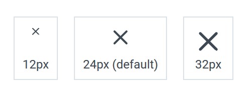
<v-icon :size=12></v-icon>

<v-icon></v-icon>

<v-icon :size=32></v-icon>
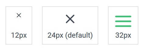
<v-icon :size=12></v-icon>

<v-icon></v-icon>

<v-icon icon="menu" fill="green" :size=32></v-icon>