Build an SVG Icon Component with Laravel 7
I don't know about you, but working with SVGs icons or images has always been a hassle. That's why I've been iterating on easy ways to reuse SVG icons in my Laravel projects.
Today I'm going to explain how to build a reusable SVG icon component using Laravel 7's new Blade components. For this, I'm going to use one of my favorite free SVG icon libraries, Feather.
The SVG icon
First, let's take a look at the SVG markup behind a typical Feather icon, for example chevron-left.svg.
<svg
    xmlns="http://www.w3.org/2000/svg"
    width="24"
    height="24"
    viewBox="0 0 24 24"
    fill="none"
    stroke="currentColor"
    stroke-width="2"
    stroke-linecap="round"
    stroke-linejoin="round"
    class="feather feather-chevron-left"
>
    <polyline points="15 18 9 12 15 6"></polyline>
</svg>
So how should our reusable component be structured? One way would be to extract the svg element as the actual component, along with sensible defaults that are already provided for us. The definition of the vector (everything that's wrapped by the svg tags) can live in its own Blade partial that can be slotted or included into the main component.
Laravel 7's Blade components
The documentation I linked above is pretty consistent but if you want something more visual, there's a free video on Laracasts that explains these new features very nicely.
To start, Laravel 7 introduced a new command to scaffold a component.
php artisan make:component Icon
This will generate 2 files: app/View/Components/Icon.php and resources/views/components/icon.blade.php, a class and the associated view respectively. You may use the --inline switch to make an inline component (meaning no view), but I'm not going to do that here.
I like to call the component class the "component controller" for what it's worth, because it does act like a controller, in a sense.
Note that I called my reusable component
Icon. I could have just as well called itSvg,Feather, or any number of things. I kind of like the idea of naming itFeather, as a way to distinguish it from other, potential, SVG images or libraries. That way, I could keep a set of tight defaults very specific to each library or similar group of SVGs.
The component class
The freshly-generated class looks like this:
namespace App\View\Components;

use Illuminate\View\Component;

class Icon extends Component
{
    public function __construct()
    {
        //
    }

    public function render()
    {
        return view('components.icon');
    }
}
Let's populate it with some defaults.
namespace App\View\Components;

use Illuminate\View\Component;

class Icon extends Component
{
    public $icon;
    public $width;
    public $height;
    public $viewBox;
    public $fill;
    public $strokeWidth;
    public $id;
    public $class;

    public function __construct(
        $icon = null,
        $width = 24,
        $height = 24,
        $viewBox = '24 24',
        $fill = 'currentColor', // currentColor, none
        $strokeWidth = 2,
        $id = null,
        $class = null
    )
    {
        $this->icon = $icon;
        $this->width = $width;
        $this->height = $height;
        $this->viewBox = $viewBox;
        $this->fill = $fill;
        $this->strokeWidth = $strokeWidth;
        $this->id = $id ?? '';
        $this->class = $class ?? '';
    }

    public function render()
    {
        return view('components.icon');
    }
}
All we're doing here is taking all the attributes from the svg element and injecting them into the constructor. We maintain the same defaults from the original SVG and save the attributes to public properties.
There is no need to pass any data to the view, since all the public properties defined in this class are available to it.
The component view
The new icon.blade.php view is very plain, containing only a div with a thoughtful quote.
<div>
    <!-- Waste no more time arguing what a good man should be, be one. - Marcus Aurelius -->
</div>
Let's replace all of that with our svg wrapper.
<svg
    xmlns="http://www.w3.org/2000/svg"
    width="{{ $width }}"
    height="{{ $height }}"
    viewBox="0 0 {{ $viewBox }}"
    fill="{{ $fill }}"
    stroke="currentColor"
    stroke-width="{{ $strokeWidth }}"
    stroke-linecap="round"
    stroke-linejoin="round"
    id="{{ $id }}"
    {{ $attributes->merge(['class' => "feather feather-$icon $class"]) }}
>
    @includeIf("icons.$icon")
</svg>
We are now referencing all those public properties that we assigned earlier in the class.
I chose to use an include rather than a slot, for convenience and to reduce duplication.
Two things are worth paying special attention to here.
First, there's $attributes->merge(['class' => "feather feather-$icon $class"]), which this tells Laravel to merge some default attribute values with new ones that may be passed by the user. In this case, the svg element will have a class of "feather feather-chevron-left" as default, but will also merge in additional classes provided by $class. This should become more apparent farther down, with actual examples.
Second, @includeIf("icons.$icon") is super-useful to prevent Laravel from blowing up if an invalid icon is requested and the include file can't be resolved.
The vector definition
The actual vector definitions for each icon live in tiny individual Blade templates. I keep mine in resources/views/icons/. Each file is named feathericon-name.blade.php. In our example, chevron-left.blade.php will contain:
<path d="M7.05 9.293L6.343 10 12 15.657l1.414-1.414L9.172 10l4.242-4.243L12 4.343z"></path>
When the icon component is rendered, this snippet will be wrapped by the svg stuff from earlier.
The component tag
Finally we get to the "how to use it" part. I really like what Laravel 7 has done here. They've adopted a Vue-like syntax for what has essentially become a dynamic pseudo-HTML tag. You invoke a component with <x-component-name />, so CoolIcon.php + cool-icon.blade.php will correspond to a <x-cool-icon /> tag.
<x-icon icon="chevron-left" width=32 height=32 viewBox="20 20" strokeWidth=0 />
Here, I'm overwriting some of the defaults: bigger icon, smaller viewBox, etc.
Had I decided to use a slot instead, here's how it might have looked (not as clean, methinks):
<x-icon width=32 height=32 viewBox="20 20" strokeWidth=0>
    @includeIf("icons.chevron-left")
</x-icon>
One thing that I don't really like but I don't have a solution for, is the fact that the IDE (PHPStorm in my case) doesn't know what to make of this new tag. I can add it to its list of accepted tags to prevent it from marking it as "Unknown html tag" but I still can't click through to the component definition.
This makes the API (the available props) opaque. For someone less experienced with the project and/or Laravel 7, it might be a bit of a hassle to find out what's going on. Overall though, I think the benefits of this new pattern far outweigh the drawbacks.
A few examples
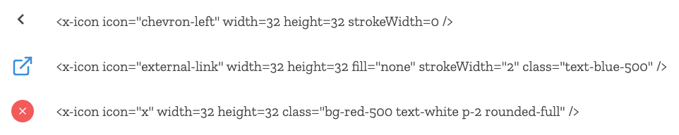
Here are just a few ways in which to use this component. For Feather Icons in particular, some icons have fill but no stroke, others have the opposite. Some icons look cleaner with varying stroke thicknesses, while others fit better if you tweak the viewBox independent of the size. All these SVG parameters are supported here, and of course you can add your own.
But what's even cooler is how seamlessly classes work. In these examples, I'm changing the appearance with TailwindCSS.
<x-icon icon="chevron-left" width=32 height=32 strokeWidth=0 />

<x-icon icon="external-link" width=32 height=32 fill="none" strokeWidth="2" class="text-blue-500" />

<x-icon icon="x" width=32 height=32 class="bg-red-500 text-white p-2 rounded-full" />
Conclusion
The hype around Laravel 7 was perfectly justified, as it has indeed brought a whole lot of cool features. The new components help propel the Blade templating engine to new heights, further strengthening an already rock-solid platform.
I always have some doubts whether a pattern is the best (hint: there's always something better), and this is no exception. While this new method of building reusable SVG components works well for me at this time, it is very possible that I will find a better way later. I will no doubt share that here if it happens but until then componentize away!.