Improve Your Site's Lighthouse Accessibility Score (and Performance) with Some Easy Fixes

Accessibility (or a11y as it is also known) is not just a fancy buzzword that you've been hearing a lot about lately. It turns out that underperforming in this category can affect not just your site's performance but also its Google search ranking.
Ideally you should aim for your entire site to be performant but sometimes you gotta pick & choose. Under most circumstances, you want to focus on your landing page because that's where most visitors land, followed closely by other popular pages.
In development, as in life, priorities dictate what piece of your app will receive the most attention. While building 1Secret.app I thought I should take a look at the landing page (after a recent revamp) to see how it scores in Google's Lighthouse performance test.
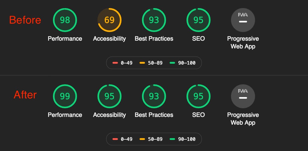
I'm primarily a Mozilla Firefox user but I still prefer to use Chrome's dev tools for various reasons. There is one thing where Chrome bests Firefox, and that is the performance test. You can access that in Dev tools > Audits > Run audits. It presents you with a bunch of scores (as shown in the hero image above) and a long list of well-documented suggested fixes.
My landing page got a lukewarm 69/100 score for accessibility, so I decided to spend a few minutes to see if there are any quick fixes I can do to improve this score.
Remove Bootstrap
When I first started building 1Secret.app I employed Bootstrap but also pulled in TailwindCSS. Needless to say, I soon started having regrets for using Bootstrap but I was too far along to bother removing it. So I used both frameworks in parallel. Which is totally legit BTW. However, performance will suffer as a result, since Bootstrap is very heavy, both in terms of CSS and JS. And not just the framework's own JS, but also 3rd party dependencies such as jQuery, Lodash and popper.js.
One day I decided to take the time and completely remove Bootstrap,. It took a few hours of painstaking work but in the end I shaved off a huge chunk from my CSS/JS bundles.
I thought Bootstrap was ancient history until Lighthouse informed me that I was referencing a chunky bit of JS that was affecting my loading time. Guess what, I had forgotten to remove the reference to Bootstrap's main library, hosted on their CDN. Basically I was still making the request to load the library, despite not using it. Duh.
Luckily that's a very easy fix. I suspect it's what pushed my Performance score from 98 to 99.
Lazy load images below the fold
One good suggestion that Lighthouse gave me is to lazy load the images below the fold. It's a very good point but unfortunately lazy loading is not yet implemented consistently across all browsers. So I made a halfhearted attempt at it, by adding Chrome's new loading attribute. I got that from this article.
In my Laravel code this is what such an image looks like:
<img loading="lazy" src="{{ asset('svg/login-chapters.svg') }}" alt="Share secrets with {{ config('app_name') }}">
Unfortunately this doesn't seem to work as I can't see the attribute being rendered by the browser, and Lighthouse still says it's a problem. I'll chalk this down as a failure. I could write some fancy JS to handle this but I hate overcomplicated solutions so I'll wait until proper browser support is implemented consistently.
Add aria-label to the site logo
My site's logo at the top left of every page is an image surrounded by an anchor. Because the anchor doesn't contain any text, it is inaccessible. So I added an aria-label attribute to describe what the link is about. Here's my Laravel before & after snippet.
Before
<a class="nav__logo" href="{{ url('/') }}" title="{{ config('app.name', '1Secret') }}" style="z-index: 1;">
    @include('partials.icons.1secret-logo', ['viewBox' => '512 512', 'width' => '42', 'height' => '42', 'class' => 'mr-2'])
</a>
After
<a aria-label="Share a secret with {{ config('app.name') }}" class="nav__logo" href="{{ url('/') }}" title="{{ config('app.name') }}">
    @include('partials.icons.1secret-logo', ['viewBox' => '512 512', 'width' => '42', 'height' => '42', 'class' => 'mr-2'])
</a>
I also happened upon another problem here which was two nested anchor tags that made no sense. That's what happens sometimes when you review your own code.
Add title to the main nav hamburger menu
Similarly, my main navigation contains a hamburger menu that renders on mobile viewports. That menu is a button containing an SVG image so there's no descriptive text for accessibility. Adding title="Main menu" takes care of the problem.
Mission accomplished
These tiny tweaks were enough to boost the landing page's Accessibility score from 69 to 95.
I won't pretend that 1Secret.app is fully accessible or maximally performant across all pages but this is a start. More importantly, this little exercise showed once again that following even a few of Lighthouse's suggestions can make a pretty significant impact on your site's performance and accessibility, which in turn has the potential to boost it higher in Google's search rankings.